
Project: Bata Heritage x Coke
- Nurul Hanum

- Apr 26, 2020
- 2 min read
Updated: Aug 19, 2021
I have worn my pairs of white canvas kickers throughout my schooling days, and chances are you have too. As we all know, a special edition of everyone’s favourite childhood shoe brand, Bata released a very exclusive, limited edition sneaker in a collaboration with the world’s largest beverage company Coca Cola. Launched on March 15 2019 last year, it is understood that only 3 types of designs that made it into the Malaysia market. Since the quality of these shoes is better than a normal Bata shoes, you will need to splurge more to get your hands on these collection. In terms of comfort, Bata can guarantee that these shoes are extremely comfortable to wear.


The Idea of the Print Ads.
How to put a fresh spin on shoes with this Coca-Cola collaboration?
The collaboration comes as Bata and Coca Cola share the distinctive red and white colors in their branding as well as values of authenticity, community and trust. The Bata Tennis collection was made especially for students to wear for their physical education classes and has been around since 1936 in India while, the revamped version of the Hotshot was first introduced as a basketball shoe in 1972. As the Bata Heritage x Coca Cola limited edition hits on nostalgia effect, merging the shared values and color of both brands, the idea of the campaign is to give a fresh view on this two iconic brand.
What do a beverage and a footwear retailer have in common?
As stated before, they’re both very much iconic, looking at their history when they started evolving. The Bata Tennis shoe has been a schoolyard mainstay since 1936, when it was first manufactured for the mentioned school children earlier. The classic design has kept kicking till this day which now meets Coca Cola’s trademark red and white colors in an array of brilliantly fun designs. Hence, we will use the red and white color as the main color of the campaign’s print ads.
The Final Output.

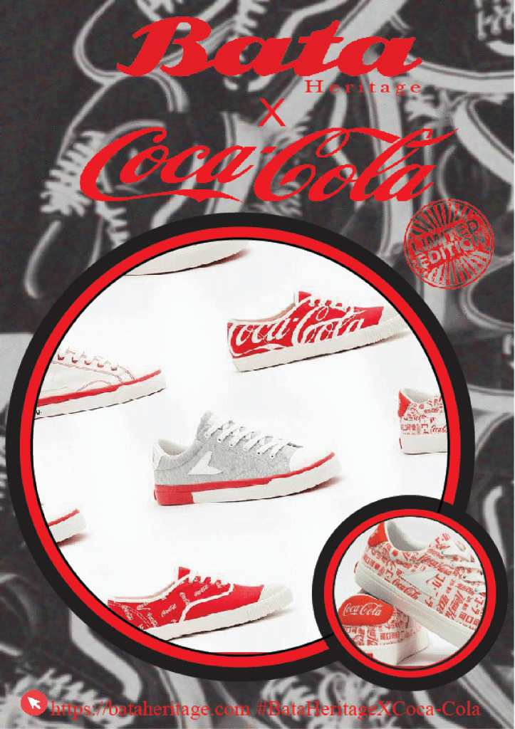
With the stamps one of the the world’s most recognizable logo and brand elements on the shoes, makes its unnecessary for me to add on more graphic of Coca cola. For me, the print is a fresh, bright and effervescent collection with various different graphic designs infused with quirky-hip vintage cool, as per our motives. However, do bear in mind, i designed the print during my Semester 2. Hence, pardon the typography selection. Have anything in mind? Share it with me in my comment box below.


Comments